A Modern Triplex in Greenwich Village

Hi Guys!

I hope everyone having  a great summer so far! I'm so happy to finally share the modern triplex I designed over the last year with you all!  I'm so proud to present this as MCD's first published project.  A bit thank you to MYDOMAINE to the exclusive feature and beautiful write up ont he project, stunning! Click here to read and view the entire home tour.

All photo's are done by Nina Choi

All florals are done by Nicolas Cogrel


xx

mc

Holi-GAY Decor Tips on @Almost30 Podcast!

Hi Guys!

Hope everyone’s week is going well! I had the pleasure of sitting down and chatting with my bff Lindsey Simcik and Krista Williams, hosts and creators of their bomb ass podcast called Almost 30, to talk about some cool, mod and of course chic, Holi-gay decor tips for this year! Is anyone else with me that they cannot even BELIEVE that it is the holidays already?! Where did Summer goooo?? I do love me some holi-gay cheer so lets break it downnn so you can have the coolest mod décor this season.

If anyone else is with me on this one too, I am SO over the traditional décor ideas. Red and Green overload, Poinsettias galore (I loathe them, no I’m not kidding, I really loathe them. Ask Lindsey ever since we were little I used to scream at my mom if she even brought them in the house #gaygenesincedayone) And those usual dam holiday wreaths that your mom hung up every year that had a giant ass red bow on them. Like we get it, it’s the holidays. Can we try something different? Like holiday mod vibez pa-leasssse!

We all want to be cool for our holiday fiestas and will look on Pinterest probably for hours to find the perfect décor ideas from food to cocktails to home décor to make sure you got that holiday party vibe on fleek. Well I got some goood ideas for you. Let’s break it downnnn.

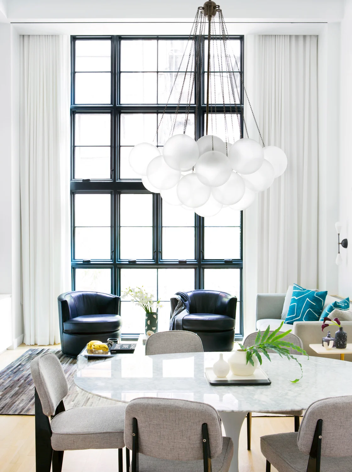
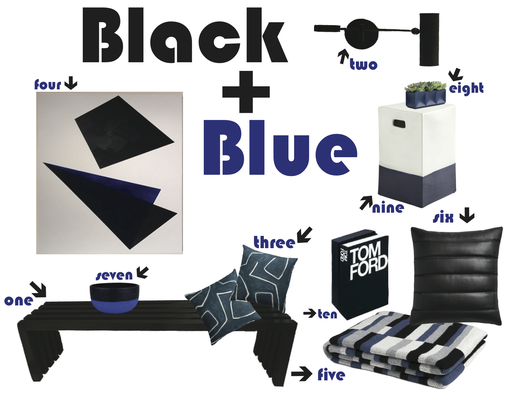
I’m OVER the traditional green and red. Why does holiday décor need to be revolved around it? Rule #1- THERE ARE NO RULES. Who cares about red and green. This year I’m switching it up and making in more mod by picking a color or two and rolling with it. Silver and white are always going to be classic for holiday décor. Why? Because snowflakes are white, Santa has a white beard and because they compliment any color or theme.

POP Color
Pick one or two of your favorite colors. For me, I love blues. You can do this through your alcohol bottle choices, ornaments and lights. Pair it with classic holiday colors of silver and white which will always compliment your color picks. You can always add in a mix or black plates or stemware to the mix for a darker-mod vibe.

Tree Décor
Continuing with your POP color theme choice. Bring this to your tree décor. Find ornaments that are blues, silvers and whites. Also, try strands of white lights instead of the typical green. It’ll definitely give your tree a mod personality and look good with your POP color ornaments.

Bar and Table Décor
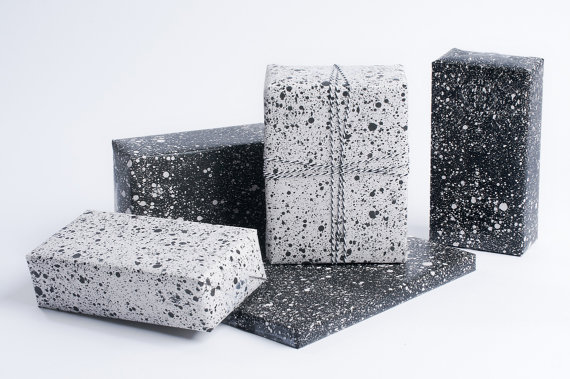
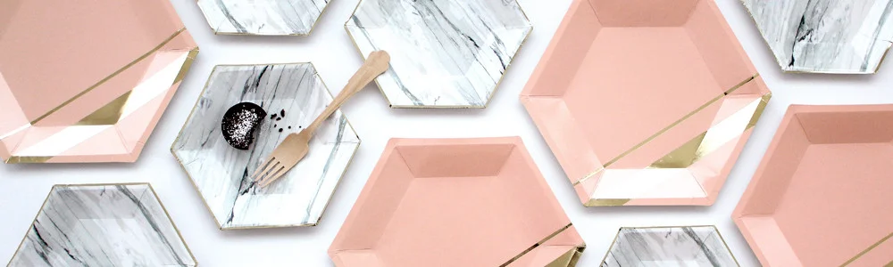
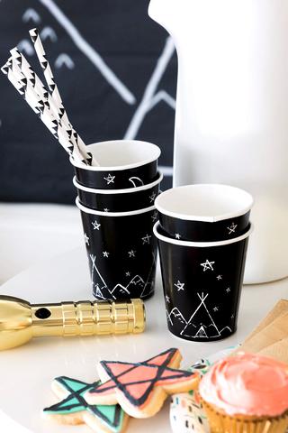
I love a cool bar or bar-cart to house the much-needed drinks for my holiday party. I always feel like I put everything together and it looks nice, but that it’s missing something. This year I’m trying something new. Find your favorite cool paper. Take a sheet and cut it to fit your bar top or bar-cart. It’ll act as a cool décor feature and makes for easy clean up the next day with all the spills that’ll happen. Here are some great and inexpensive options to choose from.

Wrap it Up
Instead of the typical snowman and reindeer wrapping paper, why not try wrapping gifts in some modern paper. These speckled patterns are sure to get a reaction from who’m ever your gifting to.

Wrap your Books Too Boo
That marble and speckled paper can go one. Step. Further. If you’re anything like me I’m obsessed with coffee table books. I am also obsessed with not having them spilled on or destroyed at my holiday party. Take that paper and wrap those babies up. It’ll protect them and just be one more feature for your holiday décor.

Place Settings
Sticking with the marble trend, these paper plates from harlowandgrey are sure to be a hit for any holiday themed party. Modern, cool and easy clean up.

Florals
Sticking with your POP color theme, find florals to match. For blue, there aren’t many options or they’re super ug’s. In my case using blues, I’d choose some fab white florals. Plopping them in a blue vase and then adding some accents of pine branches will be perfection for any floral accent. Whether this goes in your bathroom, bar-cart or table area. Remember it’s all about the contrasts between the colors. 1 POP with your neutrals of silvers and whites.

If You Can’t Find…
Anything that are in these pop colors or are on a super budg this year, just buy glass spray paint. Buy your POP color(s), white, silver and metallics. Spray paint your wreath, some pine branches, ornaments, whatever you want, just not your food plates or utensils, obvs. You can literally go to Michael’s and buy glass vases for little to nothing. They always have coupons too, so be sure to check their website.

Plate Settings
Get some cardstock from your local craft store. Cut it down to name card sizing of your liking. Then choose your POP color and metallic paints. Fold the name card so in half. Then flip it over to the folded part and dip it in a paint color. Just enough so that some paint drips down the card. Wait til dry. Then take your metallic paint and do another little dip. The two colors will run into each other and create a cool mod name card. You can also dip the bottom part in the metallic paint for a extra added look. Take a piece of holly, berry stem, or pine branch leaf and place on your plate. It’ll be sure to add some modern charm for every guest’s plate.

Straw Foam Tree
Super easy and quick DIY x-mas tree. Buy a foam cone. Then buy your favorite holiday straws (sticking with your theme still). Literally hot glue the straw to the cone and together down the back and the sides. To go one step further you can cut the straws to add dimension to your tree and add another color for every other branch layer. Just start cutting from smaller to larger going down the cone tree. It’ll add the dimensional look of layers of branches for your tree.

I hope these holi-gay tips work for you to add a cooler and much more modern holiday décor for your parties this year! Would love to see how they turn out, so send me some pics!

xx
mc

New York Live with Lilliana Vazquez!

Hi Guys!

Hope everyone had a great summer and that you’re all ready to kick Fall into gear! Personally Fall is my favorite time of year. I love the clothes, my birthday, holidays, but most of all the amazing Fall Trends! Check out my latest tips in our New York Live segment with one of the chicest stylists I know (and my friend) Lilliana Vazquez! Check out the project we did a couple years back on her home office too and her website! This girl has got the chic DOWNN!

x,
m.

BLACK + BLUE

Hi Guys!

Sorry it’s taken me this long to add some new content! Things are moving along at project #scandinavianmodern and I can’t wait to show you guys the progress soon! In the interim, I wanted to give you a little design inspo via BLACK + BLUE.

For this project, my clients and I knew that we wanted to keep the decor simple, clean, and minimal.  Focussing in on pieces that were more sculptural and could stand on their own as highlighted features in the home design of the project.  Mostly working with the palette of black, white, & grey, we knew we needed some POPs of color here and there.  Navy is one of my favorite POP’s to work with and thankfully it’s my client’s favorite color as well (can yo say win?).

I rounded up some items that we’ll be using in our project, as well as some others that would fit in any muted black, white, grey palette.  Attached are all the links and info. Let me know what you guys think!

Vignettes for the Summer

Summer is HERE and I always like to do a little refresh to my apartment for it. I recently just repainted my living room back to white to go with my fireplace and switched up my navy accent wall to black. I LOVE the results! The black and white color theme serves as a clean and rich canvas for all my accessories and styling craves.

I’ve had a lot of interest in my tulip head. It’s a JA Muse candle that I burned down. Side note | the candle is NOIR and it is one of my absolute go-to candles for that perfect balance between a masculine and feminine scent.  The candle wax is also black, so you can’t go wrong.  Once the candle burns out, your left with the muse piece of pottery.  I just take my tulips, cut them to where their heads are just a tad sticking out.  The reason is that they’ll GROW. I’m not joking, the tulips will actually grow taller like hair. It’s so bizarre, but so cool to watch every morning!

POPS of Orange and Purple to add into the mix of black, white, and grey tones.

OBSESSED with my new hairy succulent!

Literally just cut the ends of the tulips on an angle and lied on their side. It adds that DRAMA I crave for in my place and it’s soo easy to do! The acrylic tray from CB2 is the perfect base to showcase the tulips and coasters to their full potential and their POPS of color.

Layering is something I’m really into right now. I love to layer with a color story in mind.  I’ve been working on something for the last year that I’m super excited to show you all! It’s a series that I’m going to be launching soon.  The art and photographs are all made and taken by me.

Also, I just took a simple black wax pillar candle and placed it on top of the studded piece of pottery to make it a candle holder.  It allows you to play with the idea of height & depth variations.  This offers your vignette even more interest and has your eyeballs moving around all over.

#spotted

#spotted

I’m really into a POP of neon too lately..why not pink?

Hope this inspires you for some quick and easy vignette styling ideas 

Happy Pride weekend NYC! Be safe #lovewins

xx,

m.

Love Is Love

Today has been quite difficult. Emotions and feelings have been running through me as if this were 9/11 all over again.  I cannot even begin to comprehend how the families and everyone affected by this horrific act of violence in Orlando are feeling.  I wanted to take today’s post to offer my love, prayers, and support. Yesterday’s acts of homophobia, terror, and violence will NOT break my LGBTQ community or the community of America. We are strong. We are brave. We are all unique. We all can LOVE.

I had started a partnership with umbra ltd. and had pictures ready to post today, but I had to change things up a little bit due to the horrific events. As a creative, my work is the only way I truly know how to express my emotions and offer the slightest bit of hope to those in such a deep suffering state of mind right now. Please know that people HELP.  People SUPPORT. People are KIND. and those qualities will always win because those are the qualities of LOVE.  There is still so much good in this world and if people waiting in line for hours to donate blood and millions of dollars being raised in just hours to help offer support and compassion to those in need, it just goes to show that LOVE will ALWAYS conquer hate.


I am with you Orlando.

We are with you Orlando.

Stay strong.

Love,

Matthew

Serving Up Black


I’ve always been told that food is presented best when on clean crisp white plates, but I’d like to challenge that theory. I’ve been seeing black EVERYTHING for food presentation lately and I still want to dig right on in. I’m working on a new gut renovation project right now; cannot WAIT to share with you guys soon! All new dishware and flatware was needed to reflect the décor. The vibe for this project is Scandinavian city modern I like to call it. Very clean and crisp with POPs of black, yes BLACK. I wanted to try to find plate settings and flatware that would reflect the overall aesthetic of the pieces we chose. It is a large loft space with the kitchen, dining and living room all directly connected. I had a vision of black plates and flatware that would not leave my idea-crazed brain. I started my hunt. I was shocked to find SO many good options on the market and as always, at a great price point. There are also some other cool additions I found for your #tablescapechic. Here’s my round up for plates and flatware.


Crate&Barrel

Jars Tourron Black 4-Piece Place Setting

http://www.crateandbarrel.com/jars-tourron-black-4-piece-place-setting/s345121

Check weekly for updates on this project!

xx,

Matthew


Astronomy Themed Nursery In Architectural Digest

Hi Guys !

I’m SO excited to share with you the Astrology themed nursery that I designed for my clients and their twin boys!  This is Part 2 of the Regal Chic Apartment project!

Architectural Digest Feature


Full Interview Below

Designing nurseries vs other rooms

Nurseries and children’s rooms are taking on a new personality; they are becoming an extension of the home. Themes are totally acceptable, but they don’t need to be so literal anymore. When I’m designing a nursery or children’s room, I always keep this in mind.

My thought process as a designer is that the nursery is just as much for parents as it is for children. Remember, you’ll be spending a lot of time in your child’s room, so you should feel comfortable, too.

The nursery’s aesthetic shouldn’t feel starkly separate from the rest of the house. You should feel like it blends well with your overall home décor. Nurseries and children’s rooms should also be set up in a way that grows with the child. As a child grows, the room should evolve, too. It should be moldable and adaptable. By mixing more adult-like furniture with whimsical-themed accessories such as bedding, mobiles and toys the transition from baby, to toddler and eventually, child, will be much smoother than starting all over from scratch.

Breaking down priorities

Since my clients were having twins, I knew that the space needed to be thoughtfully designed and planned to accommodate double the needs. The main priority was to find placement for two cribs, a glider, changing table, and play area, while still maintaining harmony and balance. This is, after all, a place where my client needed to feel calm and at peace even while still juggling two newborns.

We also knew the twins were boys, so keeping it neutral was very important. We had just completed the living room and master bedroom using a soothing gray color palette, so we decided to extend the color into the nursery to keep the overall vibe consistent.

Why the Astronomy Theme

It all came about after my client had sent me an image of a galaxy mobile that she liked. It wasn’t exactly the style or color palette we were going for in this nursery, but it gave me all the inspiration that I needed.

I started to think of ways to create an astronomy theme that wasn’t overwhelming or too in your face. I initially thought an accent wall with galaxy wallpaper would work, but I wasn’t finding many options that worked with the vision. I ultimately found an amazing tapestry that worked perfectly in the space because it provided texture and tone. Additionally, using a tapestry as opposed to wallpaper is an awesome alternative for nurseries and children’s rooms because they can easily be swapped out or reutilized as the child gets older.

White walls for our canvas

I’m on a big white-wall kick right now. White walls are quite literally, the most amazing blank canvases. Since we knew we were going to transition the apartments overall gray-scale theme into the nursery, crisp white walls were the perfect canvas for the gray we knew we were going to bring in.

Crib placement and function

I’m a big believer in maximizing as much space as possible, especially when designing apartments and multi-functional rooms. Not only does the crib placement efficiently utilize the width of the room, but it also highlights the galaxy tapestry without cutting it off. Additionally, because I knew I wanted to place the changing table on the side of the room, I wanted to create an easy transition for my client to be able to change the babies without walking around each crib, side to side.

Show off those books!

My clients knew that they wanted to have a proper place for books. Having a wall mounted bookshelf allowed us to free up the floor space we needed for the changing table and glider. It also allowed us to display all the books my client had kept from her childhood, as well as the crocheted animals she had made. Featuring these personalized pieces gave the nursery a pop of color and air of whimsicalness. Although I initially wanted to use a custom bookshelf, I came across this shelf from RH Baby&Child that was exactly what I was looking for.

Breaking down decisions, piece by piece

The cribs were actually the first pieces we had found. Because they came with the option for gray bases, they offered the perfect way tie in the gray and white color scheme. Once we knew those were a go, the bookshelf came next. I had been on the hunt for the perfect wallpaper for an accent galaxy wall behind the cribs, but had no luck. After I stumbled upon the bookshelf on RH Baby&Child, I started browsing through their wall décor and accessories and found the galaxy tapestry. It was exactly what we needed in the space. Galaxy done chic. Not only did it provide texture and tone, but it could also be easily swapped out as the boys grow.

Sophistication and Whimsy

 I always try to achieve balance through color palette selection. Neutrals are understated while still being effortlessly sophisticated. For me, I often use neutrals as the main canvases for my designs and décor themes.  They work for any gender, any age and any theme. Because they work as blank canvases, they allow for the addition of whimsical accessories and objects. For this room, I decided to have a custom mobile made as a key accessory to add an extra touch of whimsy and go with our astronomy theme. The balance of sophistication and whimsy translates into one cohesive story throughout a room.

Creating a nursery that will grow with the child

Make sure the foundation of your room is designed and set up to grow with your child. We first achieved this by staining the floors, painting and refinishing the moldings and changing out all the light fixtures and window treatments so that the room can work with any age range. Next, find a color palette that works for your theme or space. Whether it’s by using neutrals or choosing one or two accent colors that works within your palette. In this nursery, we chose to use whites, greys, and navy. Finally, find pieces of furniture that can grow with your child, such as the dressers, light fixtures and side table we used.

Listed below are all links to items for this design!

Ceiling lamp

Sconces

Mobile

Cribs

Crib sheets

Rug

Wall bookshelves

Toy box

Dresser

Art above dresser

Armchair

Side table (next to chair)

Pillow on armchair

Wall Tapestry

Outer space Pillows


Again, a huge thank you to AD for making this dream become a reality and for their beautiful feature.  Also to Homepolish for helping make this happen.


xx,

Matthew


Photo’s courtesy of Homepolish and Morgan Yeager